
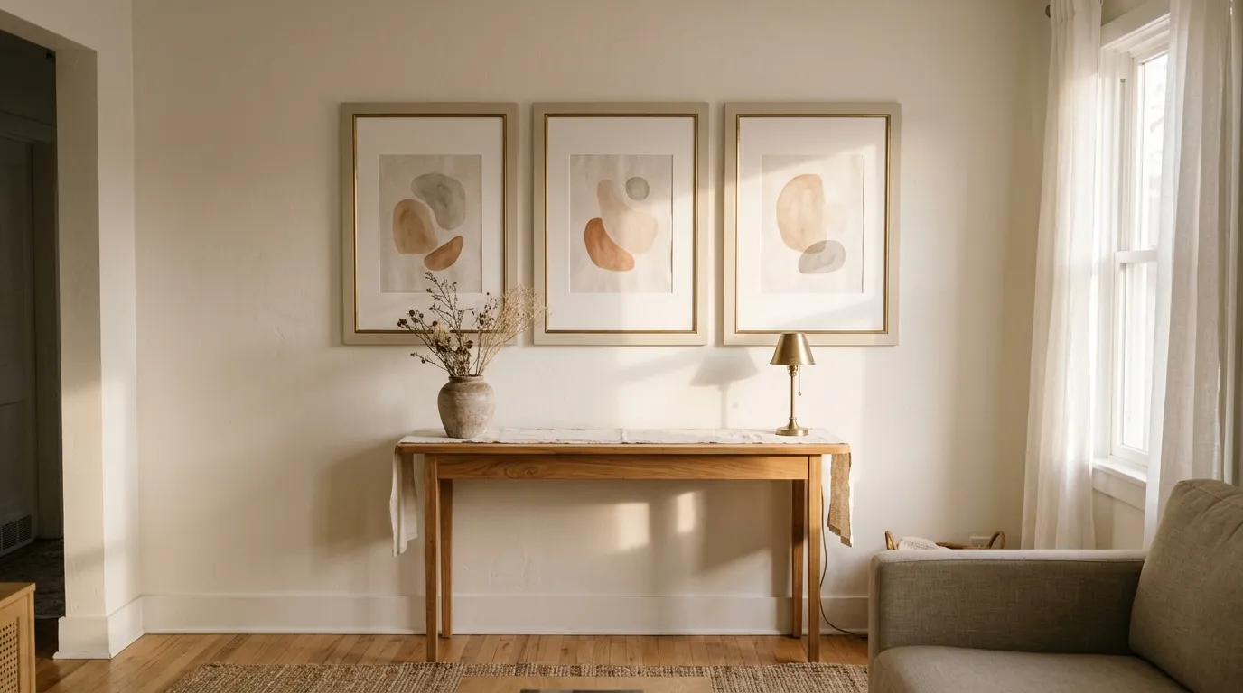
You found frames you could afford, hung them up, and the wall still looks like a clearance aisle. The thin plastic edge, the glossy finish, and the print pressed against the glass give it away. The good news is that you can make cheap frames look expensive with a few inexpensive tweaks and a little patience.
What you actually need is a frame that looks heavier, calmer, and more custom. That comes from shape, finish, the space around the art, and how you hang the group, not from a bigger price tag.
I’d start with the biggest visual change and work down to the small details. Here are seven steps you can finish over a weekend or two.
Before You Start: Materials and Time
- Time: one weekend, plus drying time for paint
- Difficulty: easy
- Budget level: budget-friendly
- Caution level: take care (ventilate when painting, use hooks rated for the weight)
What You’ll Need
- Thrifted or discount frames in plain shapes
- Fine-grit sandpaper and a dry cloth
- Primer and matte paint made for the frame’s material
- Painter’s tape
- Pre-cut mats in a warm white tone
- Heavy matte paper prints
- Tape measure and level
- Hooks or anchors rated for each frame’s weight
1. Choose Simple Frame Shapes
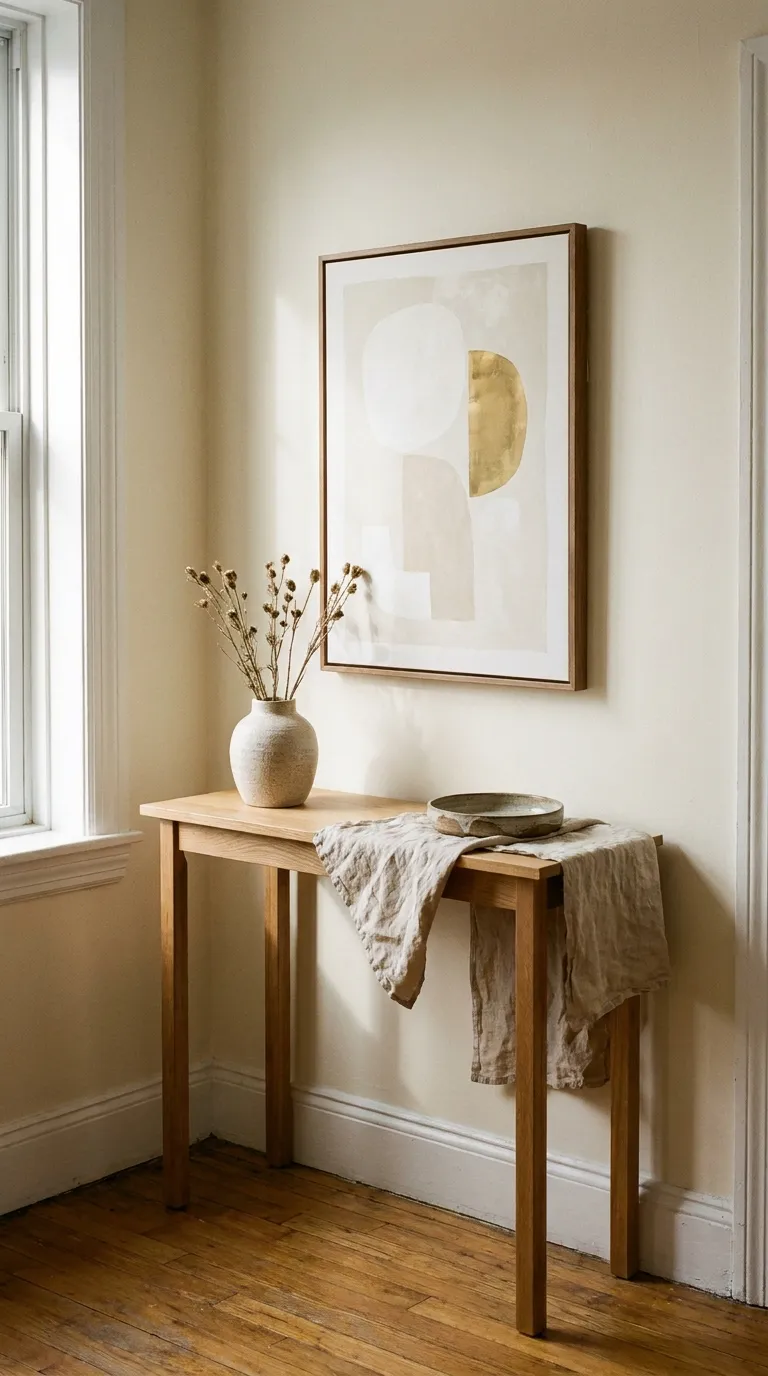
Shape does more than any other detail. A slim, flat profile with square corners reads as modern and intentional, while ornate molded edges and chunky plastic bevels read as cheap.
Before you buy anything, set a small decor budget for the whole wall, then spend most of it on the pieces people see first. Thrift stores, discount shops, and online marketplaces all stock plain frames you can upgrade.
How to Do It
- Decide how many frames the wall needs
- Pick one profile family, such as flat wood, thin metal, or plain black
- Run a finger along the edge and choose smooth and square over molded and busy
- Skip frames with warped corners or visible gaps
- Buy sizes that fit standard mats
Why It Works
Plain lines look intentional, and intentional looks expensive. The trade-off is that very simple frames show flaws more, so check corners and joins in person when you can.
Common Mistakes to Avoid
- Ornate plastic with fake gold paint
- Four different profiles on one wall
- Buying a frame before measuring the art
A Simple Rule to Remember
Choose the frame with the fewest lines on its face.
2. Paint the Frame Matte
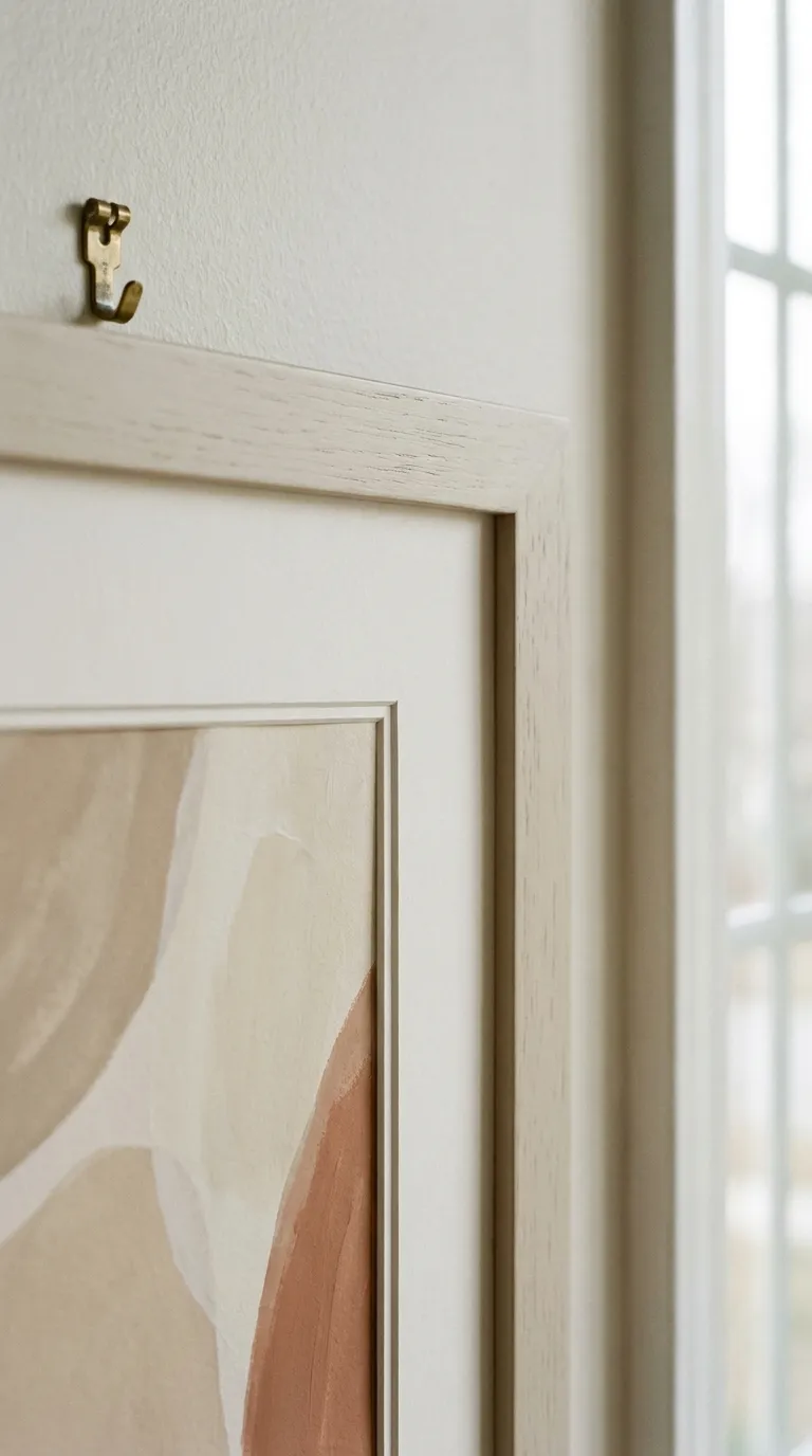
Glossy plastic and shiny faux wood are the biggest giveaways. A matte finish in one solid color hides the sheen and makes mismatched frames look like a set.
Sand lightly, prime if the surface is slick, and use thin coats. Work in a ventilated room and follow the product label for drying times.
How to Do It
- Remove the glass, backing, and hardware
- Sand the face and sides lightly so paint can grip
- Wipe away dust with a dry cloth
- Apply a primer made for slick surfaces if the frame is glossy or plastic
- Spray or brush two thin coats of matte paint, letting each coat dry fully
- Let the frame cure before you reassemble it
Why It Works
Matte paint absorbs light instead of bouncing it back, so edges look solid and even. It takes drying time, and a thick coat will drip, so thin layers always beat one heavy pass.
Common Mistakes to Avoid
- Painting glossy plastic without sanding
- One thick coat that drips
- Reassembling before the paint cures
A Simple Rule to Remember
Two thin coats beat one thick coat every time.
3. Add a Wide Mat
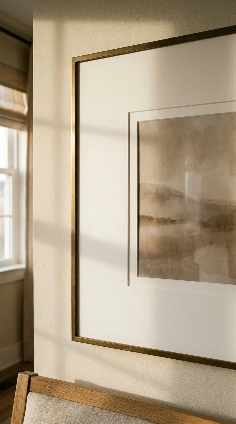
Art pressed straight against thin glass looks like a store-bought poster frame. A mat 2 to 3 inches wide adds breathing room and a soft shadow line that suggests custom framing.
To find the art opening, subtract twice the border from each side of the frame. In a 16×20 frame, a 2 inch border leaves a 12×16 opening, and a 3 inch border leaves a 10×14 opening. Wide mats shrink the visible art, so they suit prints with one clear focal point better than busy images.
How to Do It
- Measure the frame’s inside opening
- Pick a border width between 2 and 3 inches
- Subtract twice that border from the frame’s width and height to get the art opening
- Choose a warm white mat that matches the paper’s tone
- Tape the art to the back of the mat so it sits flat and centered
- Test borders in ½ inch steps before you order or cut
Why It Works
The mat separates the art from the frame so each one looks deliberate. The catch is that a mat uses up room, so a small print needs a bigger frame to stay easy to read.
Common Mistakes to Avoid
- A border under 2 inches that still feels cramped
- A bright white mat next to cream paper
- Cutting the opening before checking the art size
A Simple Rule to Remember
Aim for 2 to 3 inches of mat on every side.
Try it: slide the border width and check whether the 16×20 frame looks custom or crowded.
4. Match the Metals and Wood Tones
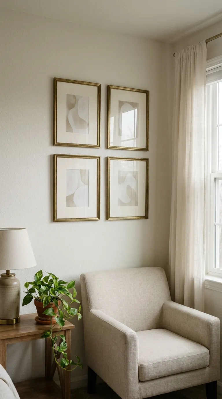
A wall of frames in five different finishes looks accidental. Limit the wall to one or two finishes, such as aged brass and matte black, and the group reads as a planned collection.
If your frames already differ, paint solves it. Repeat one finish near the room’s other metals, like a lamp base or cabinet pulls, so the wall ties into the rest of the space.
How to Do It
- Line up every frame you plan to use on the floor
- Pick the one or two finishes that show up most
- Repaint or swap out any frame that breaks the pattern
- Echo one finish in the room, such as a lamp base or a curtain rod
- Check the group from the doorway before you hang anything
Why It Works
Repetition tells the eye the choices were deliberate. You may have to retire a frame you like on its own, and that is a fair trade for a wall that looks pulled together.
Common Mistakes to Avoid
- Warm and cool metals mixed with no repeat
- Gloss on some frames and matte on others
- Matching the color but not the width of the profile
A Simple Rule to Remember
No more than two finishes on one wall.
5. Print Art on Heavy Paper
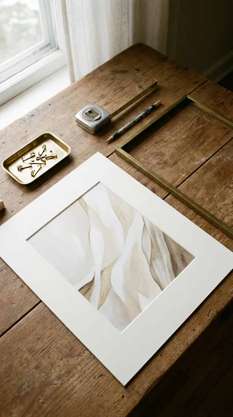
Flimsy, glossy paper wrinkles under glass and reflects every window. Heavy matte paper lies flat, cuts glare, and makes even a simple print feel like a keeper.
Order the largest size your file can support, and ask the printer for a matte or lightly textured stock. A soft, pixelated print undoes the rest of your work, so sharpness matters as much as paper.
How to Do It
- Pick art with a clear focal point and calm colors
- Ask the printer for the largest size the file can handle sharply
- Choose heavy matte or lightly textured paper
- Leave a thin blank edge so the mat has something to overlap
- Test the print behind the mat before you tape it down
Why It Works
Matte paper stays flat and avoids glare, so the art looks calm and solid. Heavy paper costs more than basic copy paper, so spend on your two or three favorite prints first.
Common Mistakes to Avoid
- Glossy paper that bounces window light
- Low-resolution files stretched past their limit
- A crop so tight that the mat hides the edge
A Simple Rule to Remember
Print at the largest size the file can handle sharply.
6. Hang the Group at the Right Height
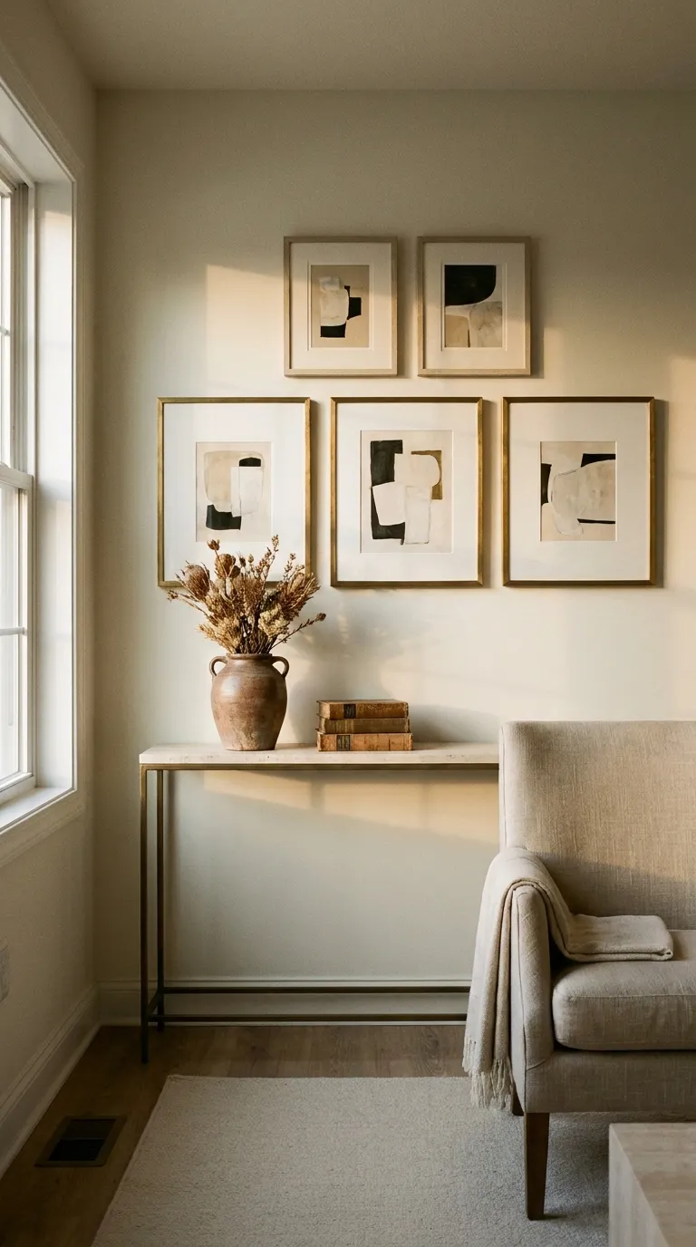
Even good frames look cheap when they float too high or crowd each other. Keep the center of the group near 57 inches from the floor so it sits at eye level, and use 57 inches as your hanging height for the middle of the arrangement. Keep 2 to 3 inches between neighboring frames.
Above a sofa, console, or bed, leave about 6 to 8 inches between the furniture and the lowest frame so the two read as one unit.
How to Do It
- Measure from the floor and mark 57 inches for the center of the group
- Cut paper templates and tape them to the wall with painter’s tape
- Keep 2 to 3 inches between frames
- Mark each hanger spot with a pencil
- Hang the first frame with a level and step back before you add the rest
Why It Works
Consistent gaps and eye-level placement make the group read as one piece of art. Tight spacing takes patience, and a crooked first nail can throw off the whole set, so test with paper templates first.
Common Mistakes to Avoid
- Hanging the group too high
- Uneven gaps between frames
- Skipping the paper templates
A Simple Rule to Remember
Center at 57 inches, gaps at 2 to 3 inches.
Renter Note
Check your lease before drilling. Adhesive hooks work for light frames within their stated weight limit, and heavier frames need anchors rated for the weight, installed by the product’s instructions.
Enter your wall size, frame count, and frame size to preview the group.
7. Finish With Light and Layers
The last step is context. A soft warm light and one layered frame make the group look styled instead of simply hung.
Layering means leaning a frame on a shelf or console and overlapping it slightly with a small object, like a ceramic vase or a short stack of books. A plug-in lamp or picture light is an easy way to add warm light, and anything wired into the wall needs a licensed electrician.
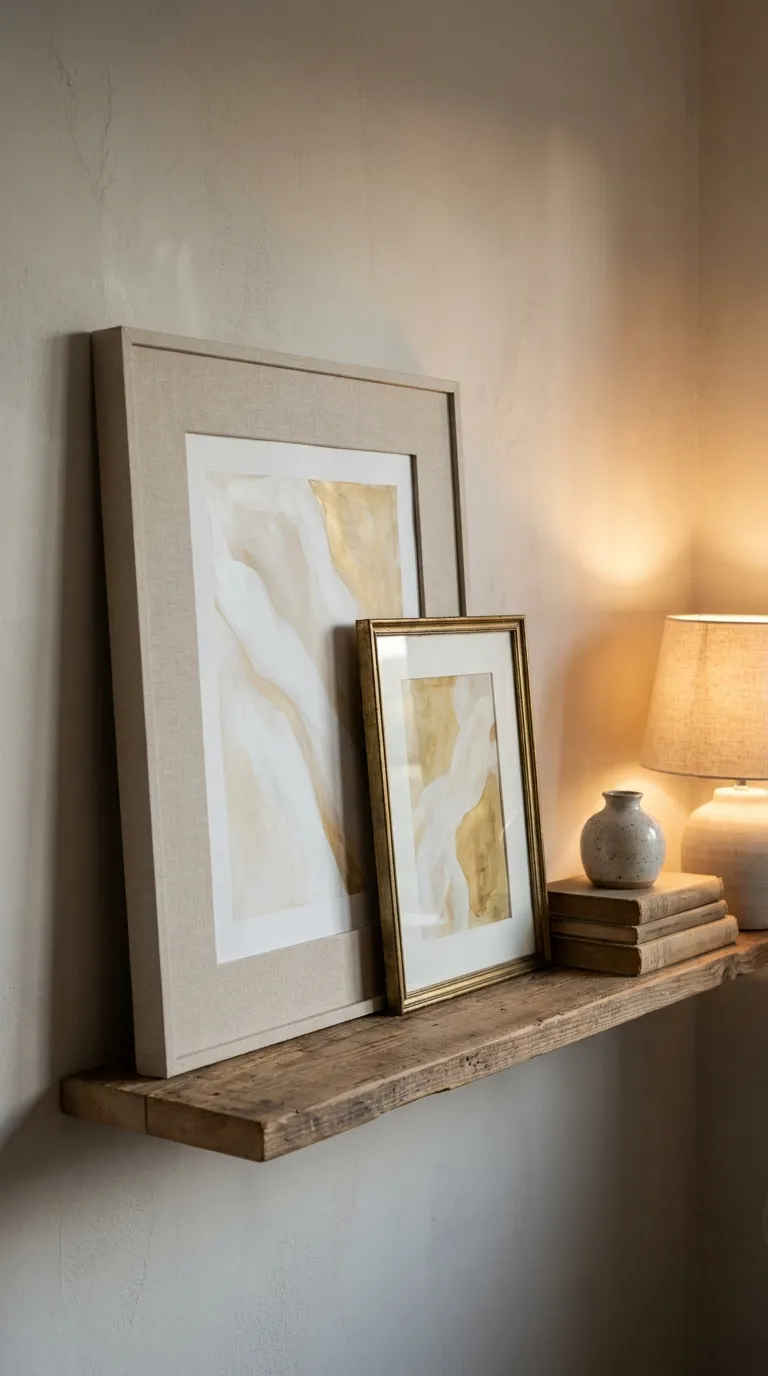
How to Do It
- Pick the strongest frame to lean or layer
- Set it on a shelf, console, or ledge with its back against the wall
- Overlap it with a small object
- Add a plug-in lamp or picture light with a warm white bulb
- Wipe the glass and check for fingerprints before you step back
Why It Works
Layers and warm light give frames depth and soft highlights, which is what makes custom pieces feel expensive. Leaned frames can slide on slick surfaces, so use removable putty or a shelf with a lip.
Common Mistakes to Avoid
- Overlapping so much that the art disappears
- A cool bulb that flattens brass finishes
- Heavy frames leaned on a narrow shelf
A Simple Rule to Remember
Overlap just enough to connect the pieces, never enough to hide the art.
Quick Step Cheat Sheet
Use this table to check each step at a glance before you hang the final group.
| Step | Why It Works | Quick Fix |
|---|---|---|
| 1. Choose Simple Frame Shapes | Plain lines look intentional | Skip ornate molded edges |
| 2. Paint the Frame Matte | Matte hides plastic sheen | Sand lightly, then thin coats |
| 3. Add a Wide Mat | Space makes art look custom | Aim for 2 to 3 inches |
| 4. Match the Metals and Wood Tones | Repeated finishes look planned | Limit to two finishes |
| 5. Print Art on Heavy Paper | Matte paper stays flat, no glare | Order the largest sharp size |
| 6. Hang the Group at the Right Height | Eye level reads as one piece | Center at 57 inches |
| 7. Finish With Light and Layers | Depth makes the wall feel styled | Add a warm lamp |
The Principles Behind These Steps
Small Upgrades That Make Cheap Frames Look Expensive
Expensive framing is mostly about restraint, space, and consistency, not materials. Each step above removes one clue that the frame came off a discount rack.
Prepare Before You Paint or Buy
Measure the art, the frames, and the wall first so your mats, paint, and prints all fit together. Ten minutes of measuring saves a second trip to the store.
Work From Big Changes to Small Ones
Do shape and finish first, then mats and prints, then hanging and light. Early choices decide the later ones, so this order saves rework.
Test Small Before You Commit
Paint a spare corner, tape paper templates to the wall, and hold a mat sample over the print. A small test is easier to undo than a finished set.
Common Cheap Frame Mistakes Worth Skipping
Mixing Too Many Looks
It happens when you collect frames over time. Pick one or two finishes and repaint the rest.
Skipping the Mat
Art against glass is the quickest tell. Add a 2 to 3 inch border and the whole frame changes.
Hanging in a Rush
Crooked spacing cancels good work. Test the layout with paper templates before you commit to nails.
Final Tips for Success
Finish One Frame First
Complete one frame from paint to print before you start the rest. It shows you which steps matter most on your wall.
Work in Short Sessions
Paint on one day and let it cure, mat and print on another, and hang on a third. Short sessions are easier to fit in and give paint time to dry.
Basics Worth Owning
- Level
- Tape measure
- Fine-grit sandpaper
- Painter’s tape
- Removable putty
Check Safety Before You Hang
Use hooks and anchors rated for each frame’s weight, check your lease before drilling, and ventilate the room when you paint. Hire a licensed electrician for anything wired into the wall.
Conclusion
You do not need pricey frames to get a wall that looks pulled together. Once you know how to make cheap frames look expensive, the work is mostly about shape, finish, and space.
Start with a simple profile, paint it matte, and give the art a mat that is 2 to 3 inches wide. Match your finishes, print on heavy paper, and hang the group with the center near 57 inches.
Finish with a warm light and one layered frame, and the wall will look planned, not patched together.
Save this guide for the next time you rearrange the room.